That’s not a hypothesis. This is the 2026 reality of digital marketing.
Typography Trends: Transforming Digital Marketing is no longer only about readable text. It’s one of the most powerful and most underused tools in a brand’s visual toolbox. The fonts you choose, the spacing you set, and the hierarchy you establish all have a direct impact on how users feel, how long they stay, and whether they convert.
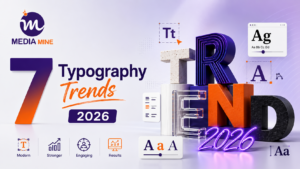
We at Media Mine 360 have seen businesses change their online presence just by changing their typography strategy. In this guide, we’ll walk you through the 7 most influential typography trends that are shaking up the digital marketing game and exactly how to use them to your brand’s advantage. Business owner, marketer, or designer, this is the Typography Trends Transforming Digital Marketing playbook you need for 2026.
Why Typography Trends Transforming Digital Marketing is More Important Than Ever in Digital Marketing
Before we dive into trends, let’s get the big question out of the way. How does typography impact digital marketing?
Typography shapes perception. A luxury brand using a playful, rounded font sends mixed signals. A tech startup using a stiff, outdated serif feels out of touch. When your fonts align with your brand personality, something powerful happens: visitors trust you faster, engage longer, and convert more readily.
Here’s what the data tells us:
93% of purchasing decisions are influenced by visual factors. Changing a single font on a call-to-action button has been shown to increase conversions by up to 30%. Users spend an average of 5.59 seconds looking at written content on a webpage before deciding to stay or leave. Typography and conversion rate optimization are more deeply connected than most marketers realize. And in 2026, the brands winning online are the ones treating typography as a strategic asset, not an afterthought.
Trend 1: Variable Fonts Are Redefining Flexibility in Web Design
One of the biggest font trends of 2026 is the widespread adoption of variable fonts, and they’re changing the game for website typography best practices across the board.
What Are Variable Fonts?
A variable font is one font file that contains a number of variations in it weight, width, slant, etc., all in one. Instead of loading 5 different font files for thin, regular, bold, italic, and heavy, you load one. That means faster loading times, smoother animations, and more expressive type.
Why This Matters To Your Brand
Variable fonts offer designers a lot of freedom of expression without sacrificing performance. Hover-activated text weight animation Responsive type scales to fit the screen size Create truly distinctive typographic identities that rise above the noise of the digital world
Variable fonts are a godsend for user experience design building firms. They cut down page weight, improve Core Web Vitals scores and contribute to smooth and engaging visual experiences that users actually enjoy.
Actionable tip: If you’re still using multiple static font files on your website, switch to a variable font alternative to improve your page speed score and unlock new creative opportunities for your brand.
Trend 2: Punchy Brand Statements with Expressive Display Fonts
Minimalism had its moment. In 2026, brands are going bold and expressive display fonts are leading the charge in modern typography for brand growth.
The Emergence of Character-Driven Type
It’s the end of the era when all sites look the same with safe, neutral sans-serifs. Today, the most memorable brands are going for fonts with personality, edgy serifs with an editorial edge, hand-crafted typography that feels human, and oversized headlines that demand attention. Think about the brands you remember best. Their typography had to say something. That is on purpose.
Serif vs Sans-Serif: Which Font Is Better for Your Brand in 2024?
This is one of the most common questions we get at Media Mine 360, and the honest answer is it depends on your brand story. Serif fonts (such as Playfair Display or Cormorant) are fonts that convey trust, tradition, and sophistication. They work beautifully for luxury goods, legal services, finance, and editorial brands.
Sans-serif fonts (such as Inter, Neue Haas Grotesk, or DM Sans) are modern, clean, and friendly. They lead in technology, SaaS, and health and lifestyle brands.
Use display and novelty fonts for headlines and hero sections, not for body copy. They can make a strong first impression and be legible too. The best fonts for business websites in 2026 are the ones that actually represent your brand values and are still easy to read on all devices.
Trend 3: Kinetic Typography turns static pages into dynamic experiences
A picture is worth a thousand words, but animated text is worth even more, especially for typography and user engagement.
What Is Kinetic Type?
Kinetic typography is text in motion. That includes scroll-triggered animations, self-typing text, purposeful fade-ins, and headlines that switch states. Used well it guides the eye, builds story momentum and keeps people scrolling…
Impact on Digital Marketing
Today, kinetic typography is among the core tools in visual branding strategies of brands that want to create immersive digital experiences. It’s especially effective for landing pages, hero sections, and product displays.
But there is a thin line between engaging and overloading. The guiding principle: animation should aid communication, not get in the way of it. If your text animation slows your page or confuses the message, it’s working against you.
Actionable tip: Start small. A simple scroll-triggered fade-in for your headline can add personality and depth without impacting performance. Tools like GSAP, Framer Motion, and CSS animations make this more accessible than ever.
Trend 4: Retro and Humanist Fonts Are Bringing Warmth Back to Digital Branding
In a world of AI-generated content and automated everything, something genuinely human feels refreshing, and humanist Typography Trends Transforming Digital Marketing is tapping directly into that emotion.
The Nostalgia Effect in Font Trends 2026
Typewriter aesthetics, warm art deco lettering, chunky ’70s grooves, and retro-inspired fonts are gaining momentum because they evoke an emotional response. In a world that can feel cold and generic, they make brands feel relatable, human, and trustworthy.
This trend is being heavily used by brands in food, lifestyle, wellness, fashion, and creative services as part of their brand identity design strategy.
Humanist Sans-Serifs for Everyday Business Use
For businesses that want a modern yet approachable feel, humanist sans-serifs like Nunito, Jost, Outfit, and Plus Jakarta Sans are among the most recommended professional font choices for businesses in 2026. They’re clean enough for professional settings but warm enough to feel human, a balance that converts.
Trend 5: Accessible Typography Is Now a Non-Negotiable Standard
Here’s a trend that’s less about aesthetics and more about responsibility — and it directly affects your SEO, your legal standing, and your conversion rates.
Typography Accessibility in 2026
Digital accessibility regulations are tightening globally. WCAG 2.2 guidelines and soon WCAG 3.0 require that text on websites meet minimum contrast ratios, size requirements, and legibility standards.
But beyond compliance, accessible typography trends transforming digital marketing dramatically improve user experience design for everyone. High contrast text, adequate line spacing, and appropriate font sizes reduce cognitive load and make your content easier to consume which keeps users on your page longer.
Best Practices for Accessible Web Typography
- Minimum body font size: 16px (never go below 14px)
- Line height: 1.5 to 1.8 for body text
- Contrast ratio: minimum 4.5:1 for normal text
- Avoid using light grey text on white backgrounds
- Choose fonts designed for screen legibility Google Fonts like Roboto, Open Sans, and Lato are reliable, accessible choices
This is at the heart of website typography best practices, and it’s one of the quickest wins available to any business looking to improve both UX and SEO performance.
Trend 6: Brand-Exclusive Custom Fonts Are the New Competitive Advantage
When everyone has access to the same Google Fonts, how do you stand out? You commission or license a font that’s uniquely yours. Major global brands from Airbnb to Netflix to Apple have invested in custom typefaces as an essential part of their brand identity. This approach is trickling down to mid-market companies and ambitious startups who realize that digital branding via Typography Trends Transforming Digital Marketing is one of the most defensible differentiators available in 2026.
A custom font means no competitor can look like you. Your visual identity becomes impossible to replicate exactly. Every email, social post, banner ad, and web page reinforces the same distinct brand voice visually.
Is a Custom Font Right for Your Business?
Custom fonts are a significant investment, but not out of reach for growing brands. Bespoke type design is available from Fontsmith and Dalton Maag, while Adobe Fonts provides thousands of exclusive, high-quality fonts not found on free font sites.
If you’re not willing to shell out for a full custom design, try combining an interesting display font with a simple, standard body font. This results in a unique brand feel without the cost of a fully custom typeface.
Media Mine 360‘s branding professionals guide companies in making strategic font choices that blend creativity, accessibility, and commercial viability. Discover more about our branding services and how we can assist you in defining your visual identity.
Trend 7: Dark Mode Typography Needs to be Optimized
As dark mode becomes the default display setting for more and more users globally, brands can no longer afford to design typography for light backgrounds only.
Why Dark Mode is a Game-Changer for Text
A font that is crisp and legible on a white background can be heavy, blurry, or overwhelming on a dark one. Certain font weights that look good in light mode will need to be adjusted (usually to lighter weights) in dark mode to ensure the same visual clarity.
Dark Mode Typography Guidelines
Use lighter font weights (300-400) for body copy on dark backgrounds
Avoid using pure white (#FFFFFF) on pure black (#000000). The contrast is too high, which will strain your eyes. Use off-white colors like #F0F0F0 or #E8E8E8. Slightly increase letter spacing to improve legibility. Test your typography in both modes during development; never assume light-mode optimization carries over Typography is one of the most obvious aspects of user experience, and the pitfalls of typography are never more obvious than in dark mode. Doing this well is a sign of professionalism and attention to detail that users will notice even if they can’t put a finger on why.
FAQs of Digital Marketing Typography
Q1. How does typography influence digital marketing performance?
Typography affects how your users perceive your brand, how long they stay on your website, and if they convert. The wrong font choice can increase your site’s bounce rate. Good Typography Trends Transforming digital marketing will improve readability, trust, and conversion rates. Part of the overall user experience is working with color, layout, and content.
Q2. What are the top fonts for business websites in 2026?
Inter, DM Sans, Nunito, and Open Sans are the leaders for high legibility for body text. Expressive display fonts paired with clean body typefaces create contrast and visual hierarchy within headlines. The choice you make should reflect your brand personality, audience and industry.
Q3. What is the difference between an end user and a subscriber? Who Are End Users and Subscribers? How Does Typography Impact Conversion Rate Optimization?
Studies show that font choice, size, contrast, and spacing all affect how users interact with CTAs, forms, and landing pages. Improving typographic hierarchy, making it visually clear what action to take next, can significantly lift conversion rates without changing a single word of copy.
Q4: Are Google Fonts still good enough for professional business websites?
Yes, Google Fonts has hundreds of high-quality, performance-optimized fonts that are great for professional websites. The trick is to pick fonts that work for your brand and combine them in creative ways. But if brand differentiation matters to you, an Adobe font or a commissioned custom typeface is a clear competitive advantage.
Q5. How many fonts should I use on a website?
As a rule of thumb, stick to a maximum of two or three fonts per website. One font for headlines, one for body text, and an optional accent font for specific UI elements. Too much font use creates visual chaos, dilutes brand identity, and slows down page load times. The rapidly growing brands online understand that every font is a brand decision, every headline is a conversion opportunity, and every word on screen is an opportunity to build trust with the reader. From performance-boosting variable fonts to personality-packed display faces, the typography trends transforming digital marketing trends shaping digital marketing this year reward purposeful, consistent, and daring brands. If your current typography trends transforming digital marketing are dated, generic, or inconsistent, it’s costing you more than you think. Not only design, but traffic, engagement, and revenue.
Ready to take your brand’s digital footprint from zero to hero?
Media Mine 360 uses creative talent and data-informed strategy to create brands that not only look good but also perform. We offer end-to-end solutions from brand identity design to SEO-friendly web development and content creation to help businesses stand out and thrive in competitive digital markets.
👉 Visit mediamine360.com to explore how we can elevate your brand and make every letter count.